Wear your heart
on your sleeve.

A connected wearable that helps university students turn shared interests into real, face-to-face moments.

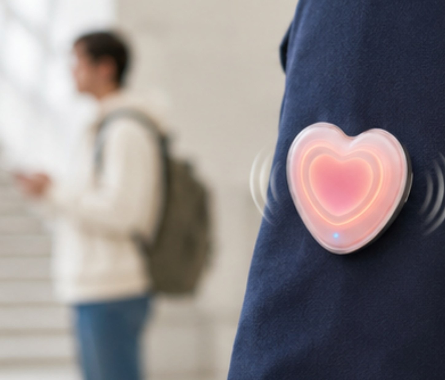
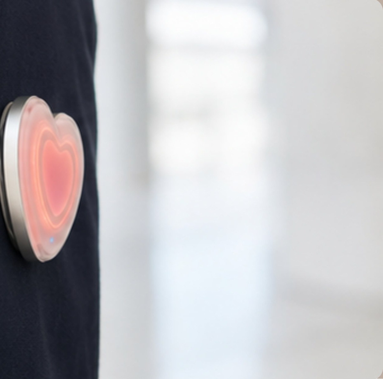
Spark Heart Pin worn by a student on campus

The project in one line

Technology notices the connection.
People decide what happens next.

My role

UI design, prototyping, iteration, campaign design and video performance

Focus

Interaction design · wearable technology · campus connection

Context

Group project

Product overview

A wearable signal supported by a private digital system.

The pin, phone and watch work together: students control what they share, notice a compatible signal and decide whether to connect face-to-face.

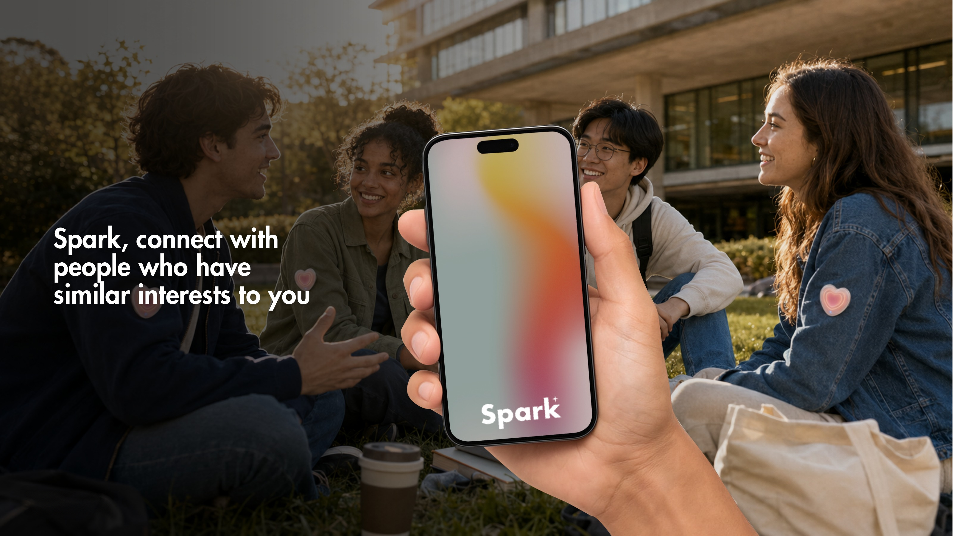
Spark product overview presentation board
Overview · Spark connects students through shared interests.
Spark physical prototype presentation board
Physical prototype · Testing form, glow and wearability.
Spark final interface presentation board
Final system · Phone and Apple Watch touchpoints.

01 · The observation

It started with the quiet between classes.

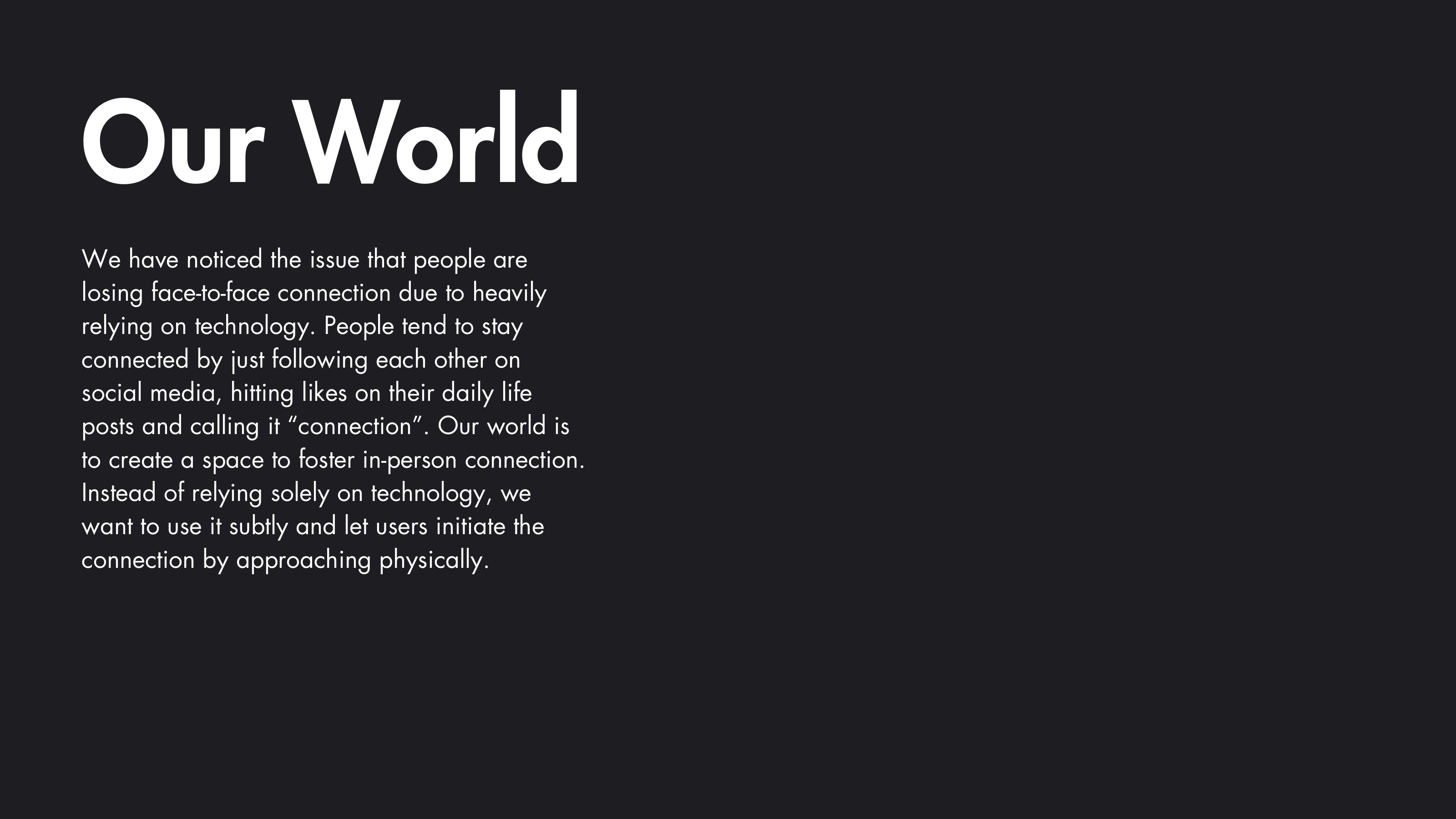
As an international student, I knew the strange feeling of arriving somewhere new while everyone else seemed to have already found their people.

My earlier campus observation showed students constantly moving - to class, to lunch, then home. They crossed paths all day, yet rarely stayed long enough to meet someone new.

How might we help students notice the people they could have connected with?
Full Spark problem presentation board

From passive data

to a visible signal

to a human choice

02 · The concept

A small signal for a possible connection.

Spark is a heart-shaped pin connected to a student's university profile and smart devices. When two nearby students share compatible interests, their pins glow in the same colour and pulse like a heartbeat.

The pin does not introduce them, reveal personal details or automate the conversation. It simply creates a moment of recognition.

  1. Set your preferences.Choose what you are open to sharing and the kind of connection you want.
  2. Notice the signal.Matching pins glow and vibrate when compatible students are nearby.
  3. Make the move.Approach, pause the pin or keep walking - the decision stays human.
Two matching Spark pins glowing the same colourSpark heart pin concept worn visibly on clothing
The design principle

Use technology to open the door.
Do not let it enter the conversation.

03 · Designing the experience

From a glowing object
to a complete system.

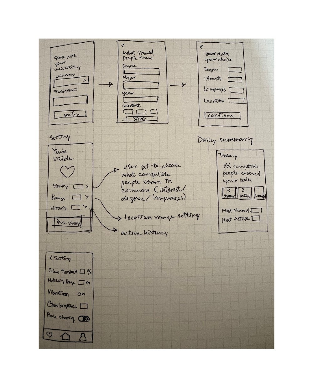
I began with low-fidelity flows for onboarding, pin setup, daily review and settings. The physical and digital experience evolved together, so the pin never felt disconnected from the interface behind it.

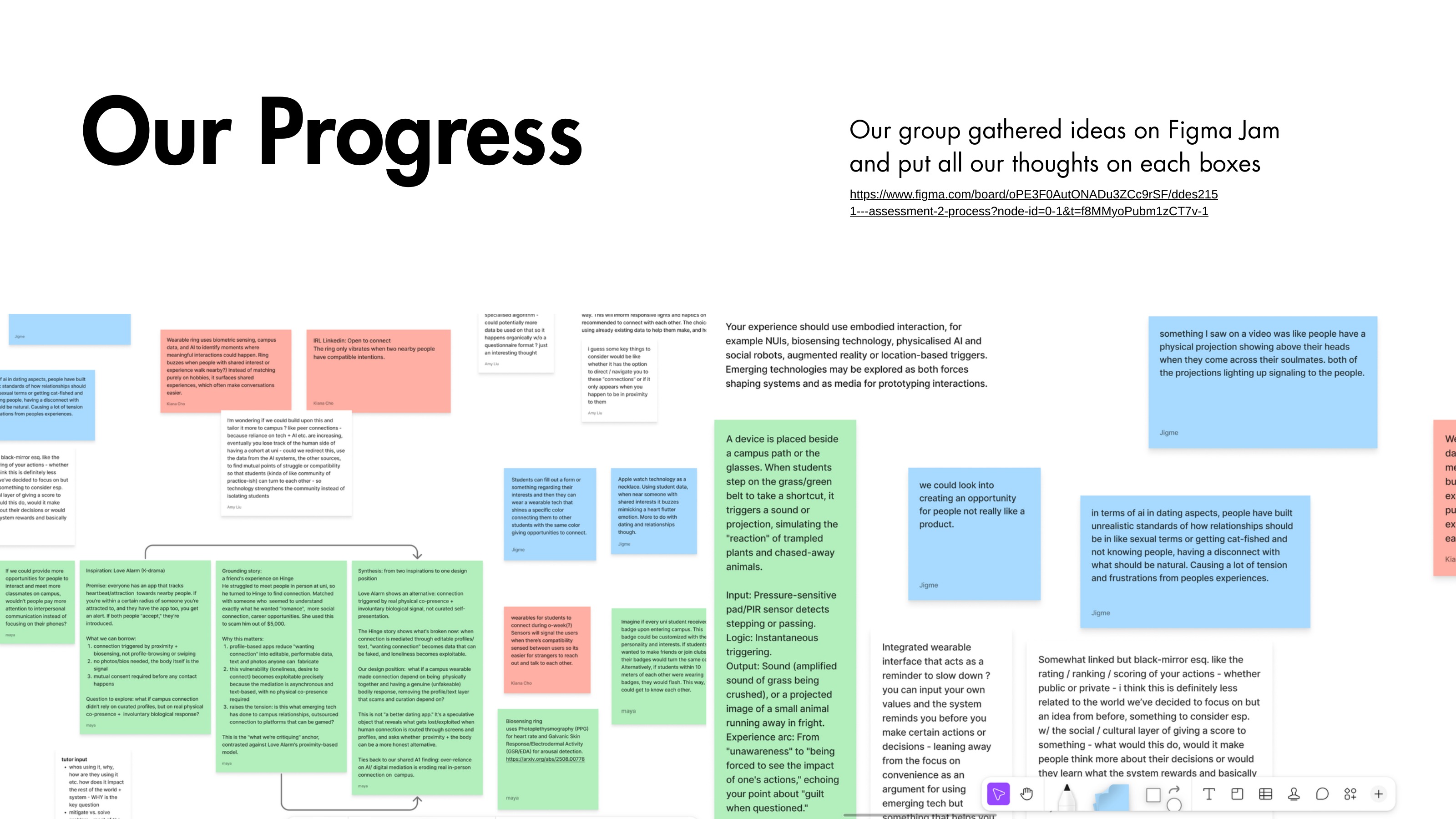
Full Spark research synthesis board
Research synthesis · Turning campus observations into design directions.
Full Spark low-fidelity interface board
Low-fi · Mapping onboarding, privacy and connection choices.
Full Spark mid-fidelity interface board
Mid-fi · Establishing hierarchy before visual styling.
Full Spark high-fidelity iteration board
Hi-fi iteration · Improving clarity, colour and consent controls.
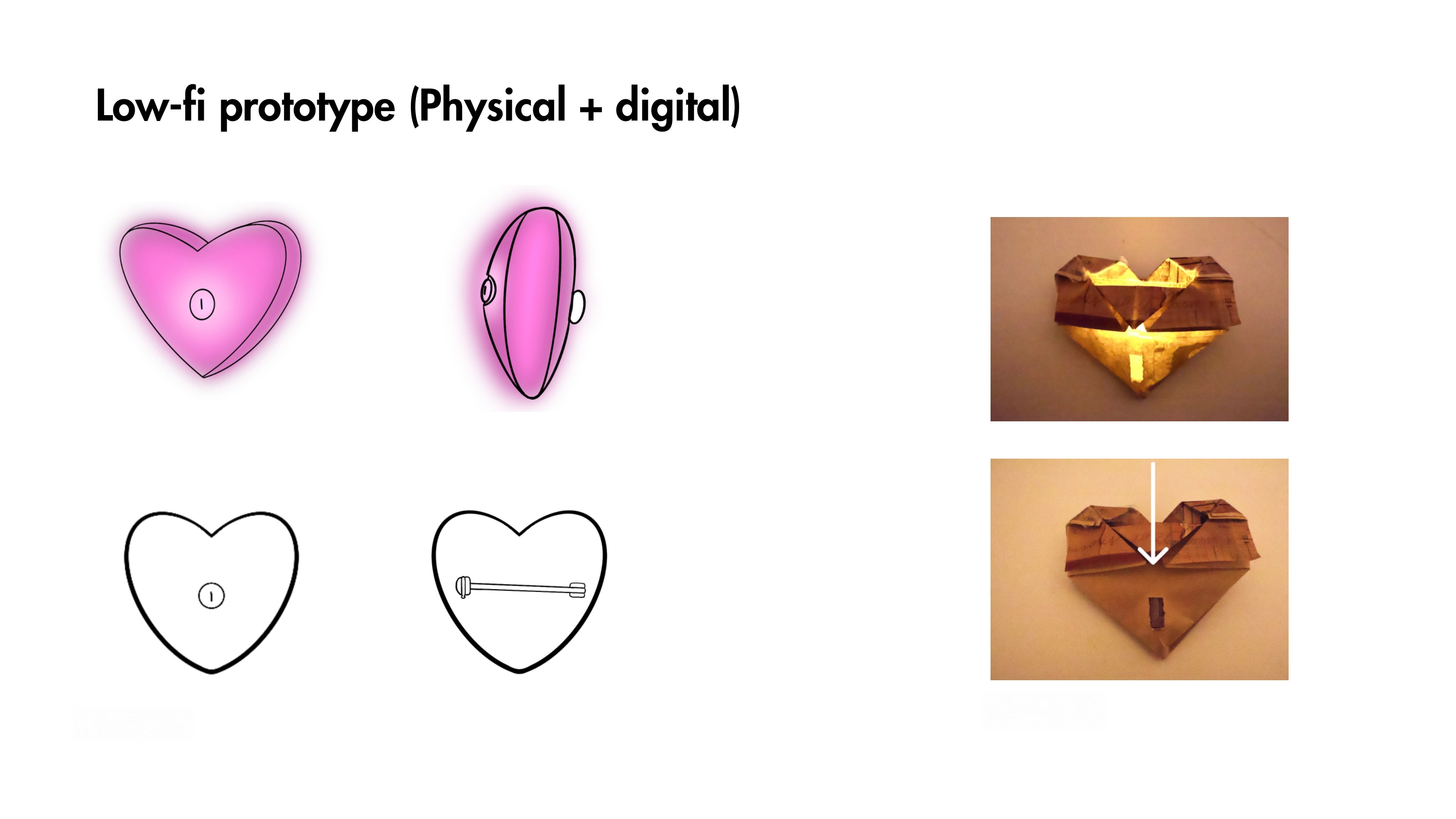
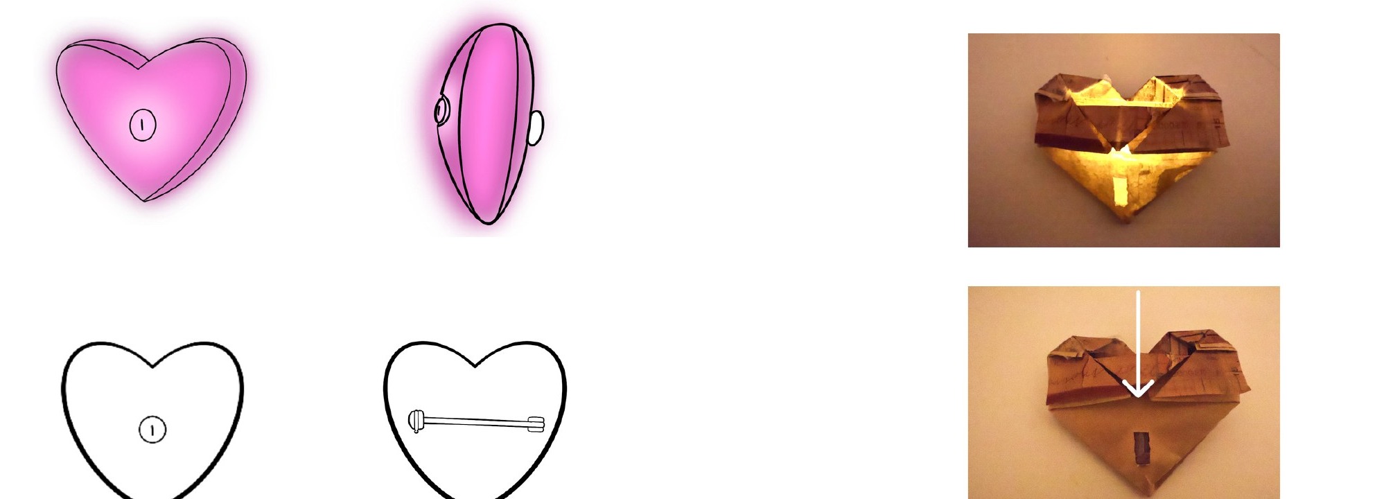
Low-fidelity physical Spark pin sketches and paper prototypes
Low-fi · Physical

Testing the signal as an object

Heart-pin sketches and paper prototypes explored wearability, glow, vibration and how the signal could be understood at a glance.

Low-fidelity Spark interface sketches
Low-fi · Interface

Mapping the complete service

Rough flows connected onboarding, visibility controls, matching preferences and the end-of-day reflection before visual styling began.

Mid-fidelity Spark onboarding and privacy flow
Mid-fi

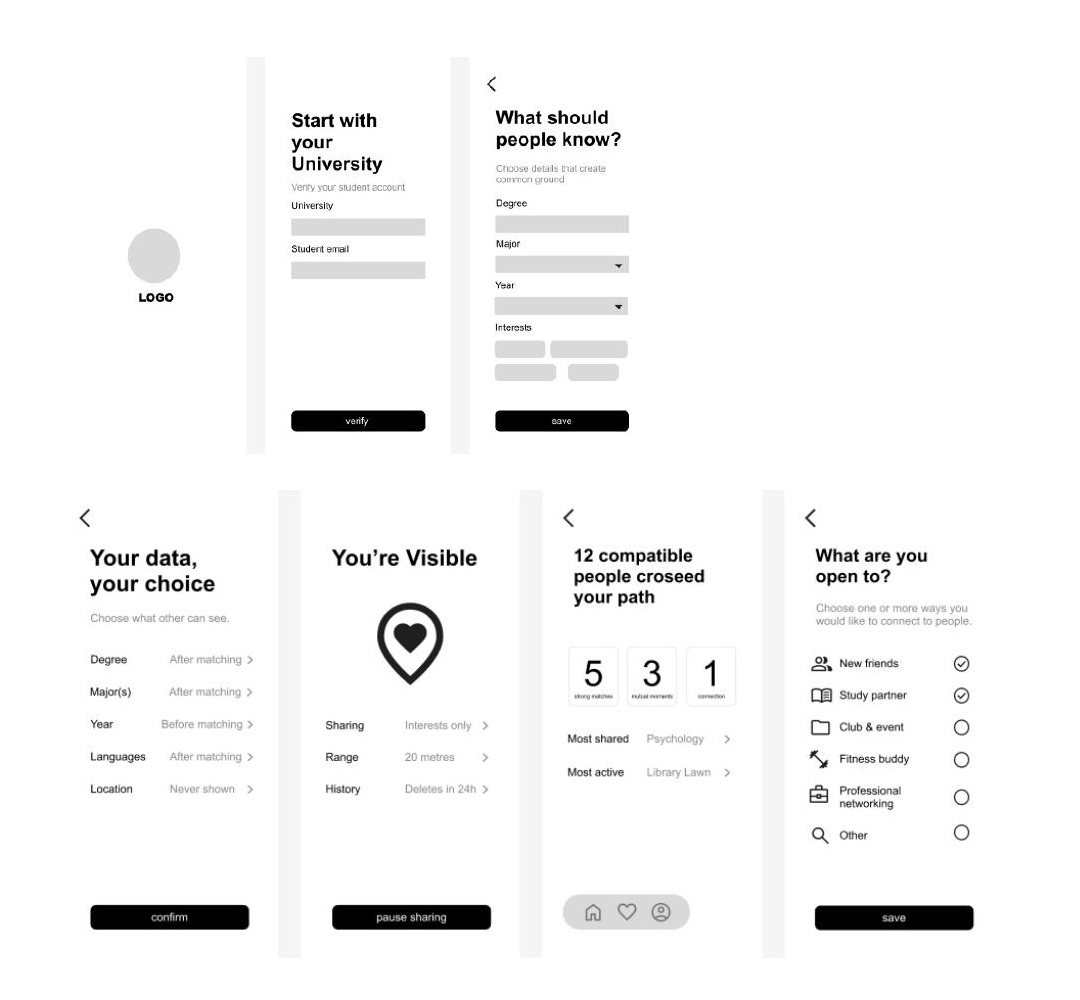
Making privacy settings explicit

The first structured screens made university verification, data visibility, connection goals and sharing controls concrete enough to critique.

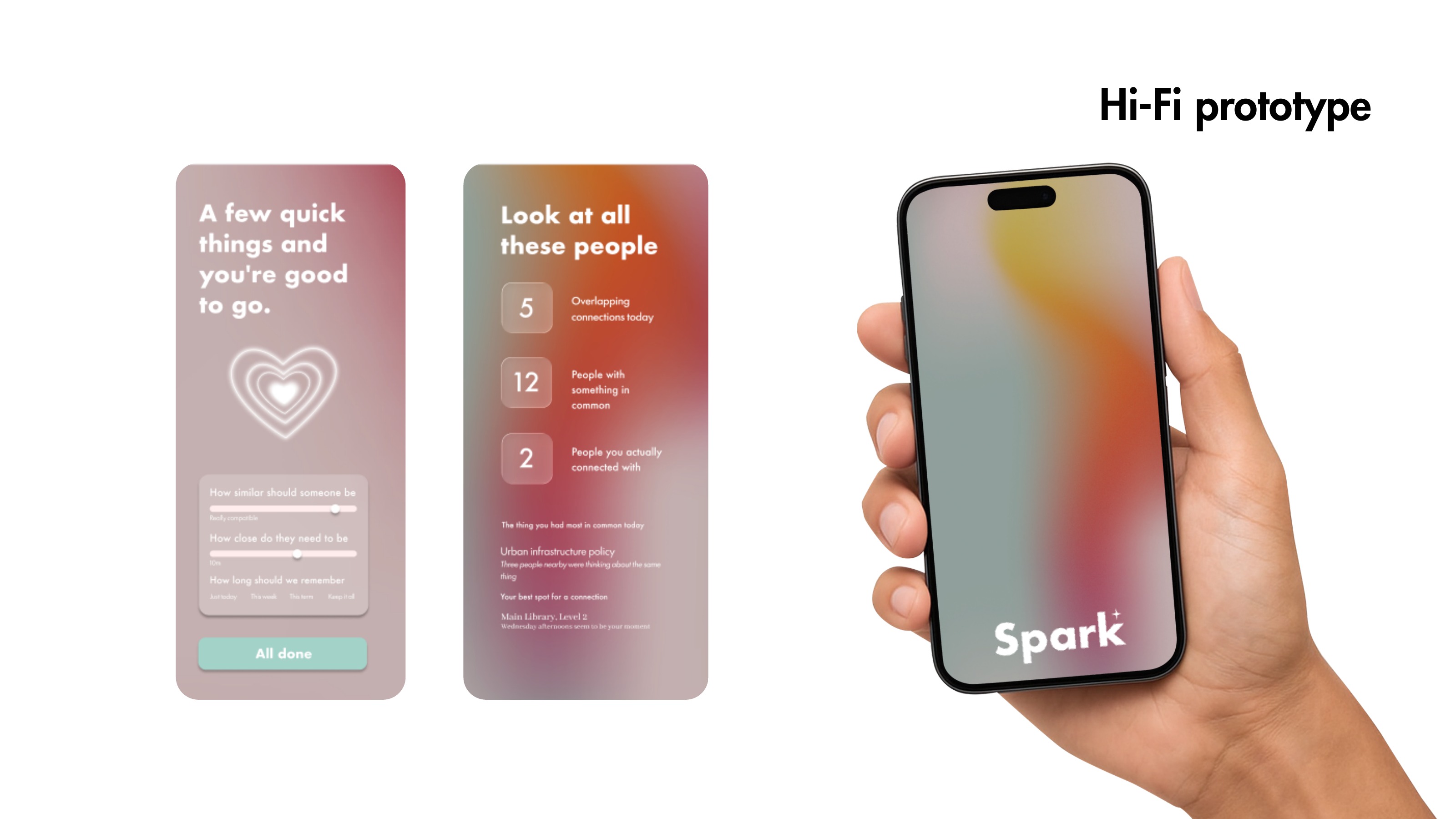
First high-fidelity Spark interface screens
Hi-fi · First pass

Establishing the visual language

Soft gradients and a glowing heart created warmth, but the first version needed stronger hierarchy and more readable type.

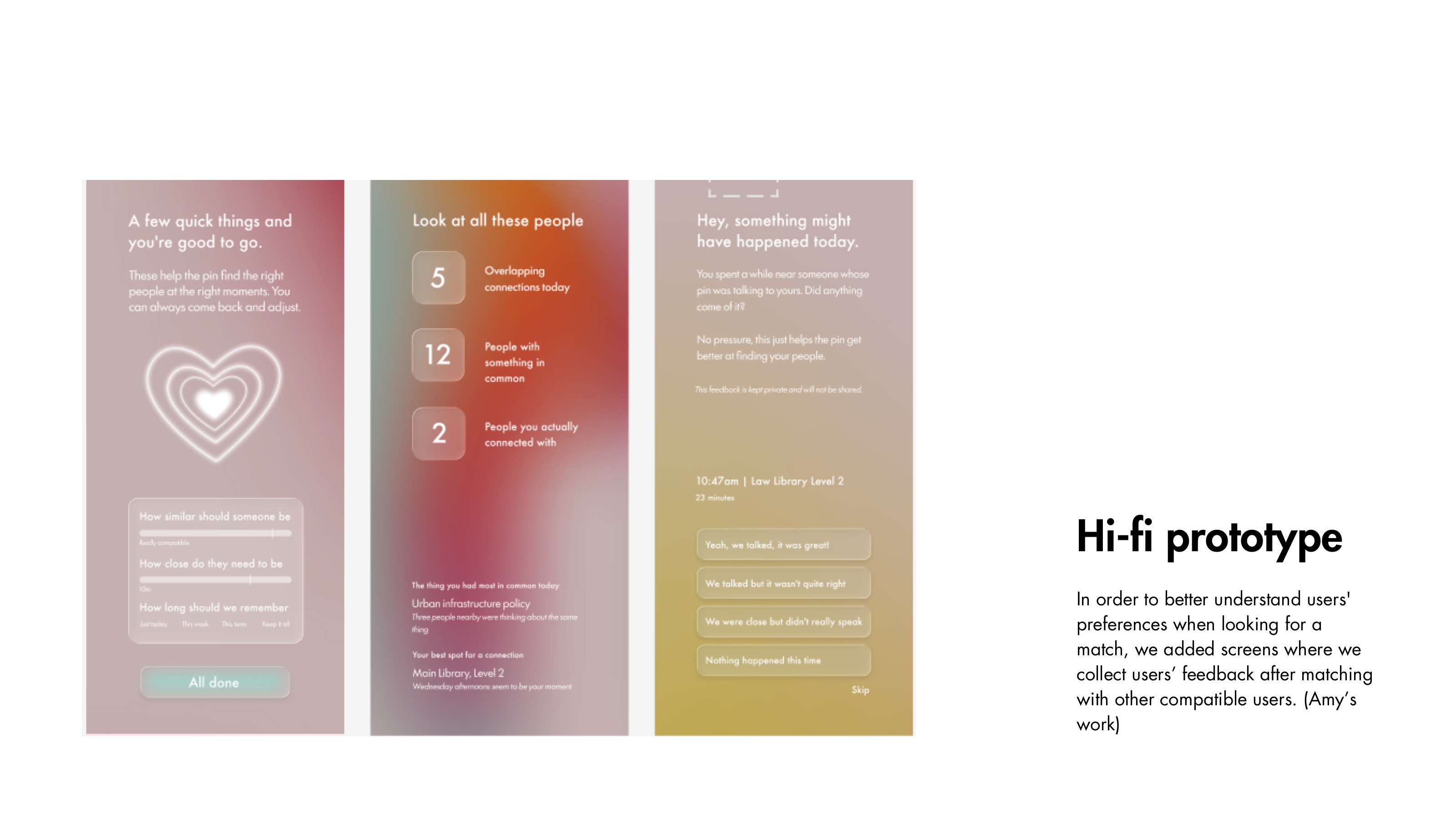
Spark onboarding screens before and after hierarchy improvements
Iteration 01

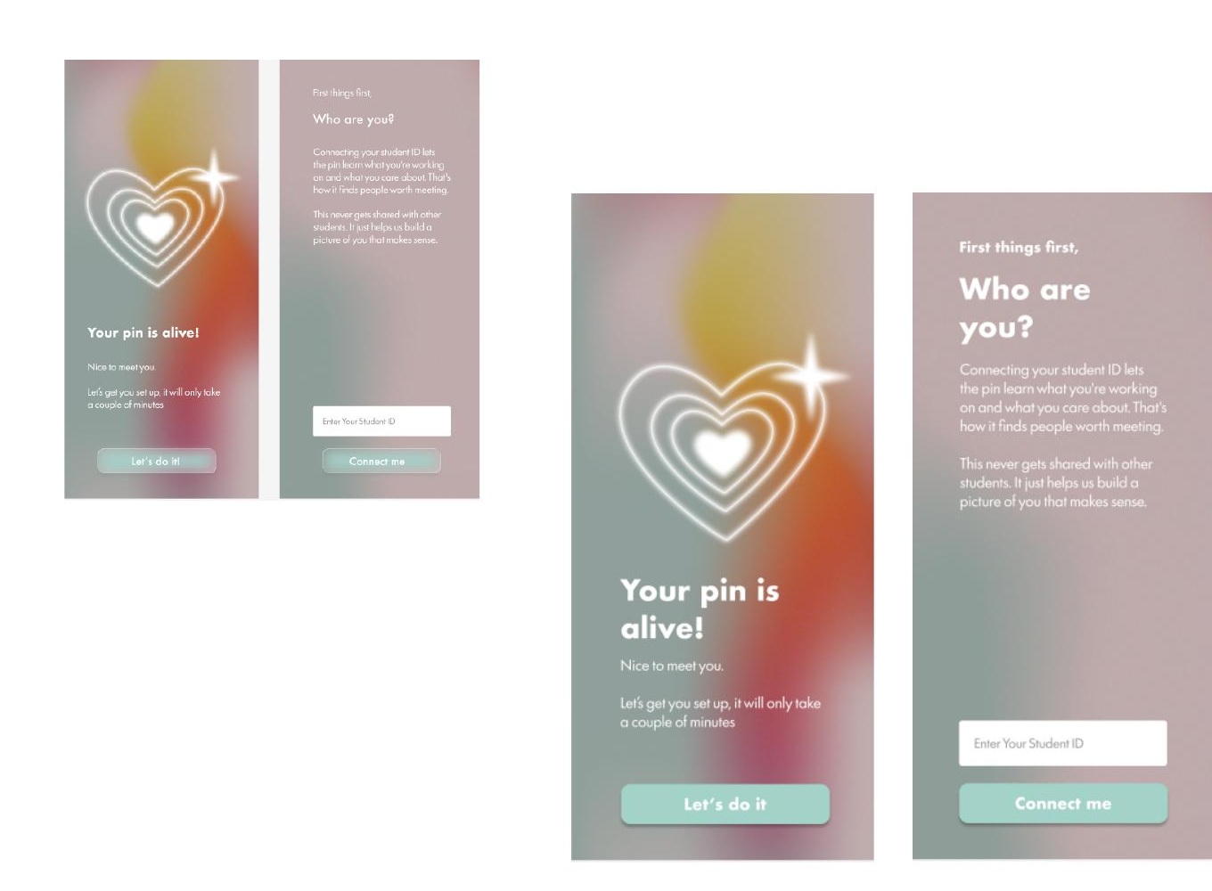
Clarifying onboarding

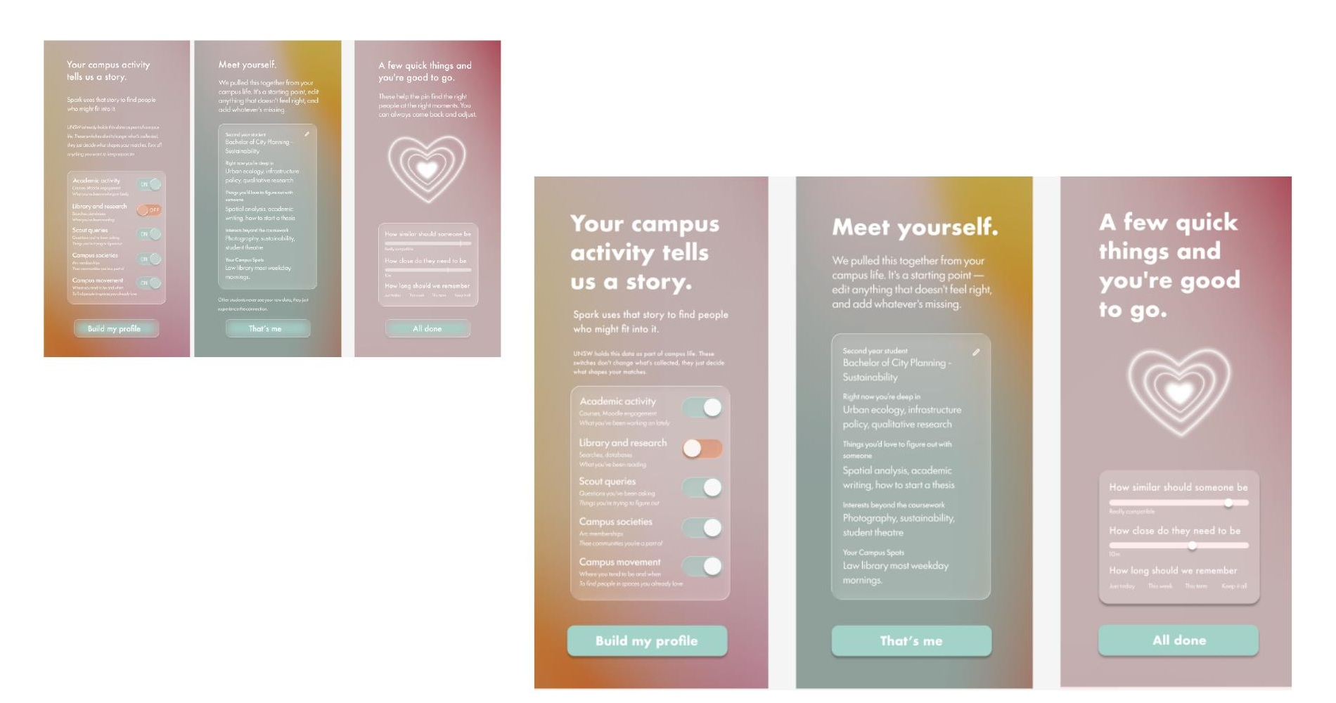
Titles became larger, actions more visible and student-data explanations easier to scan before asking for consent.

Refined Spark campus data and matching setup screens
Iteration 02

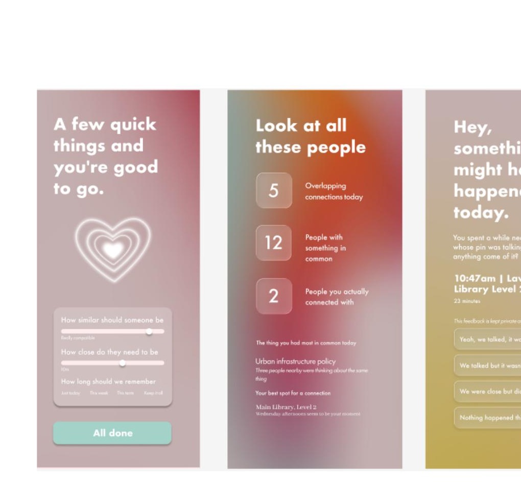
Turning campus data into choices

Profile controls, compatibility thresholds and the final setup screen were refined into a clearer sequence with less cognitive load.

04 · The turning point

Less information made the interaction more human.

Early screens exposed details about compatible people. We removed them. Showing too much turned another person into a data profile and made the real conversation unnecessary.

We kept matches private, added controls to stop the pin from glowing, and let students choose whether to approach. This changed Spark from a people-finder into a gentle invitation.

Before

See another student's data and decide from a profile.

After

See only a shared signal, then learn about them through conversation.

05 · Iteration log

Three decisions that made Spark safer and more human.

Each iteration reduced the amount of technology competing with the face-to-face moment.

01

Matching needed boundaries

Started withLocation and shared-interest data automatically identified nearby matches.

What I learnedWithout clear controls, the experience could feel intrusive rather than helpful.

What changedI added compatibility thresholds, connection modes, permissions and an easy way to pause the pin.
02

Less data created more connection

Started withEarly screens revealed details about a compatible person before students met.

What I learnedProfiles encouraged judgement from data and removed the reason to begin a real conversation.

What changedThe final system shows only a shared colour signal and keeps personal information private.

03

Control had to work in the moment

Started withMost controls initially lived inside the mobile app.

What I learnedOpening a phone while approaching someone interrupted the spontaneous campus moment.

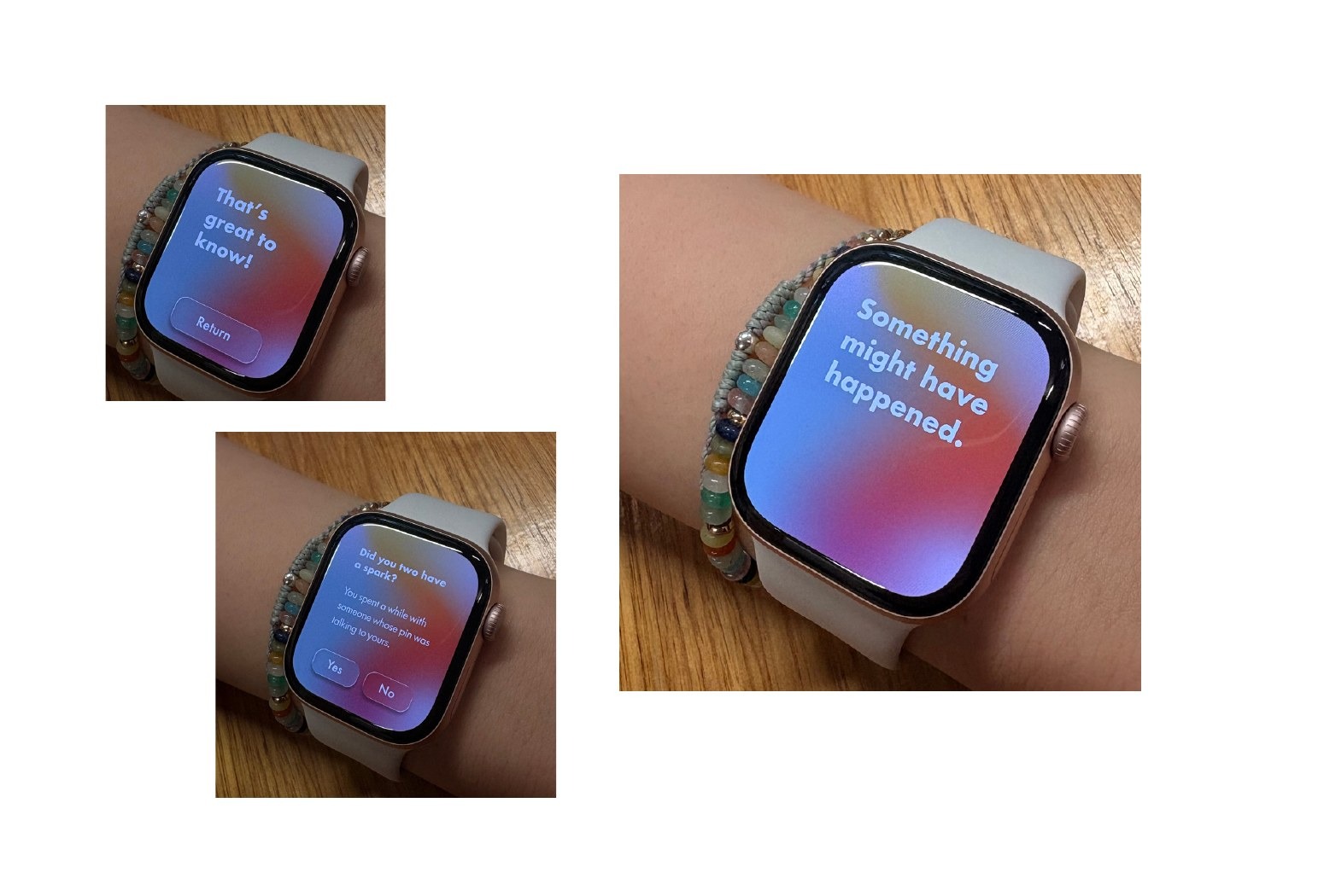
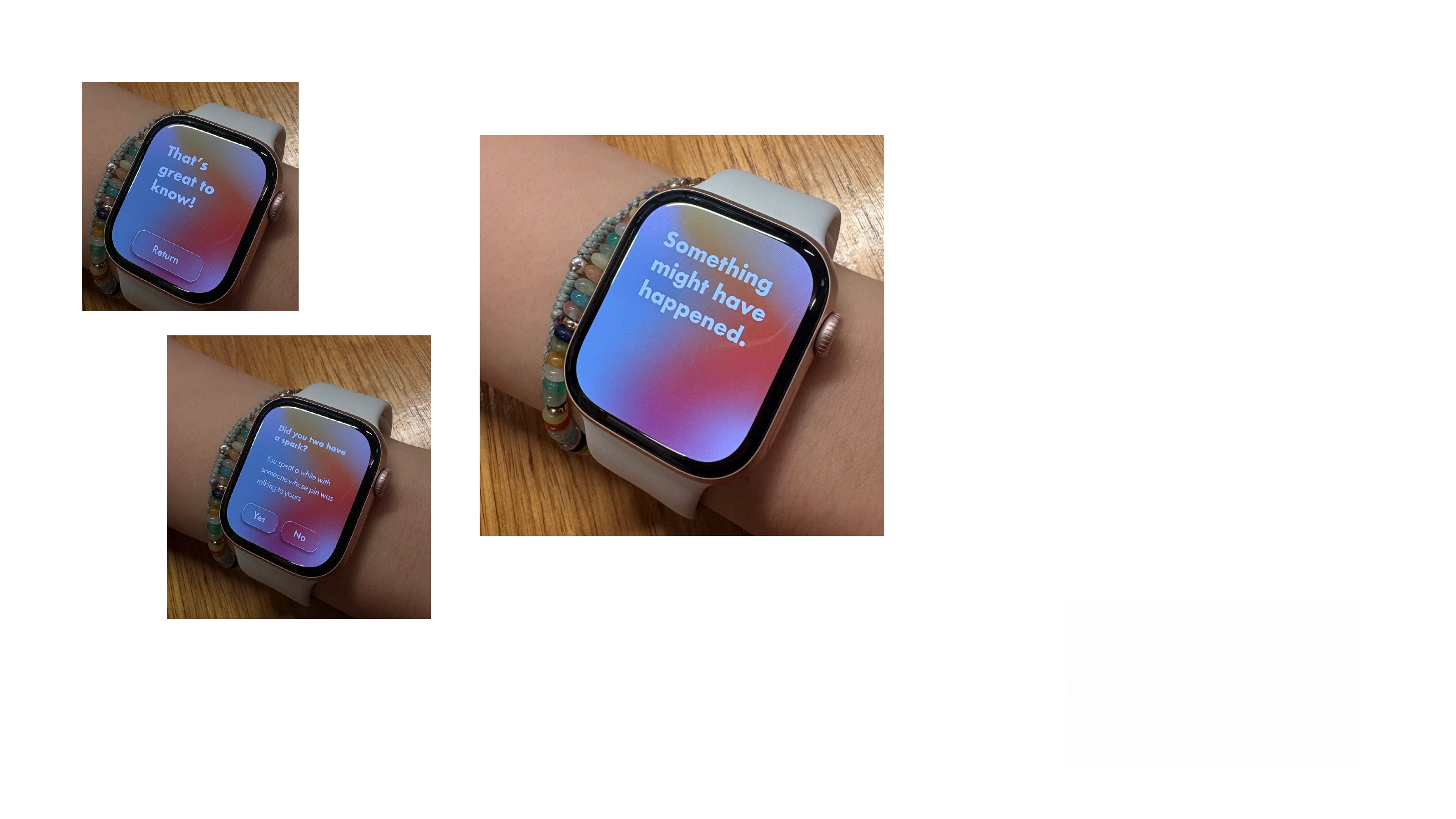
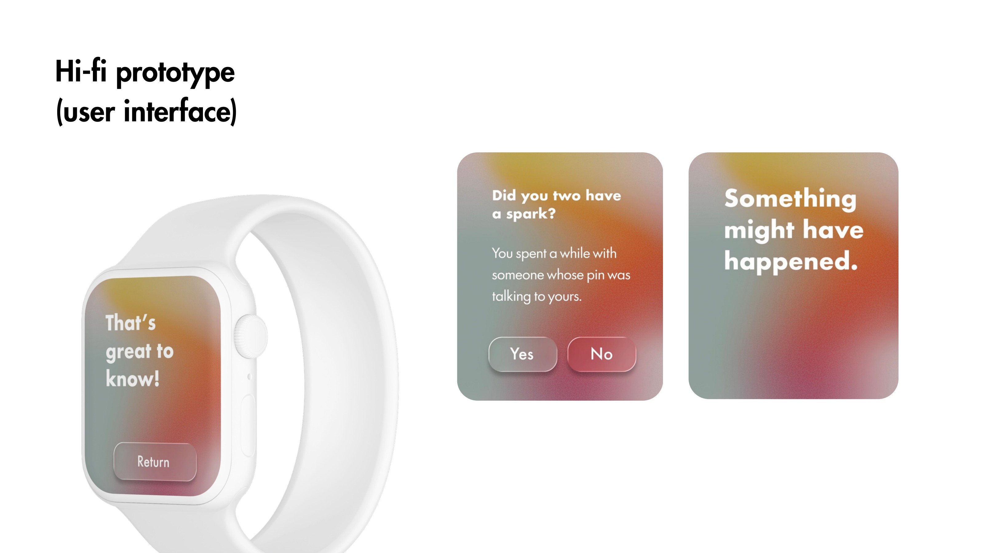
What changedApple Watch controls support pausing, ignoring and mutually connecting without breaking eye contact.

06 · The outcome

A wearable, an interface and a story people could imagine joining.

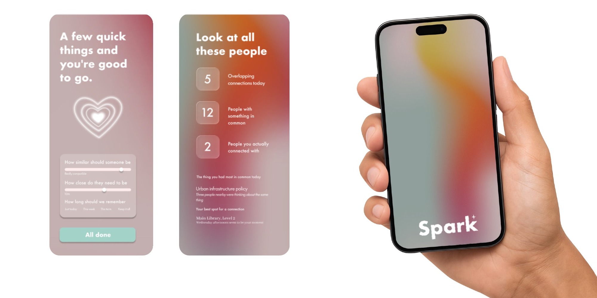
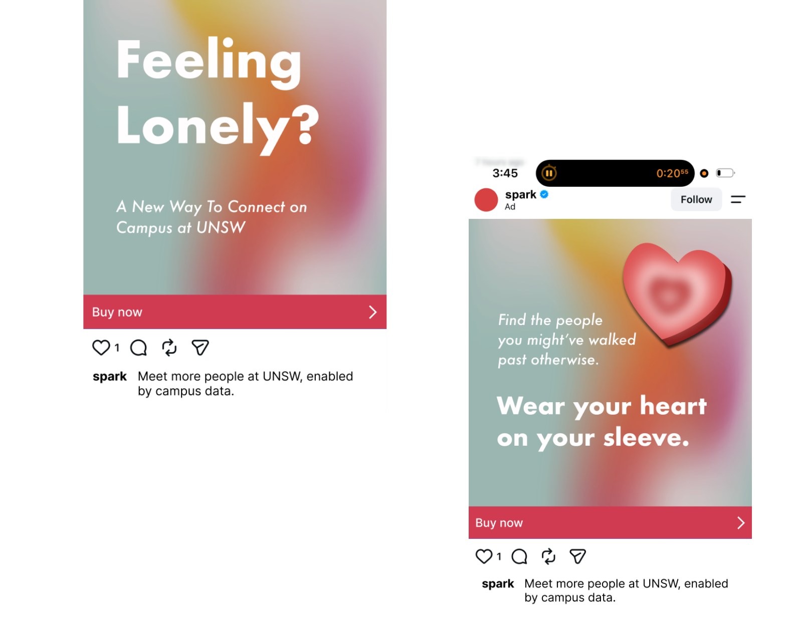
I refined the UI hierarchy and readability, extended the experience to Apple Watch, and designed campaign elements for our final video. Together, these touchpoints showed Spark not as another social feed, but as a reason to look up from one.

High fidelity Spark mobile interface and phone mockup
Spark Instagram campaign design encouraging campus connectionSpark interface tested on Apple Watch

Reflection

The goal was never to manufacture friendship.

It was to help someone realise that a possible connection was already nearby. Spark taught me that interaction design can create an opening without controlling the outcome - and that sometimes the most human choice is knowing when technology should step back.

Explore another project