A collection of editorial, identity and campaign systems designed to carry a story across page, post and print.
(The collection)
Good layouts don’t just hold information. They set its rhythm.
FocusEditorial systems · brand identity · campaign design
ApproachStrong hierarchy, expressive type and colour with purpose
Selected workSix visual stories across digital, social and print
01 / 06
Editorial design
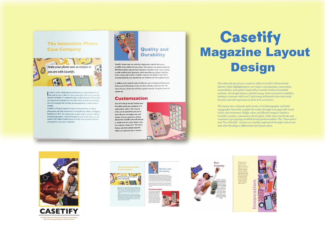
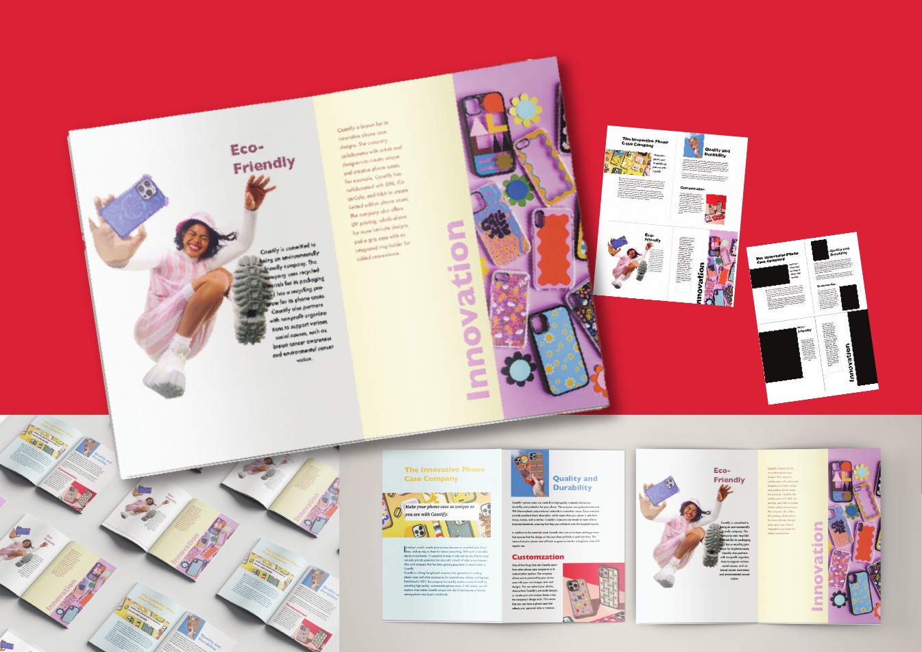
Casetify Magazine Layout
A bold editorial system that translates Casetify’s energetic brand into print. Dynamic grids, vertical type and vivid product photography guide the reader through stories of customisation, innovation and sustainability.
01 · Structure
Mapped the editorial content into a clear hierarchy before styling individual spreads.
02 · Exploration
Tested dynamic grids, vertical type and colour blocking to reflect Casetify’s energy.
03 · Refinement
Balanced vivid imagery with breathing room so the brand stayed bold without losing readability.
02 / 06
Visual identity
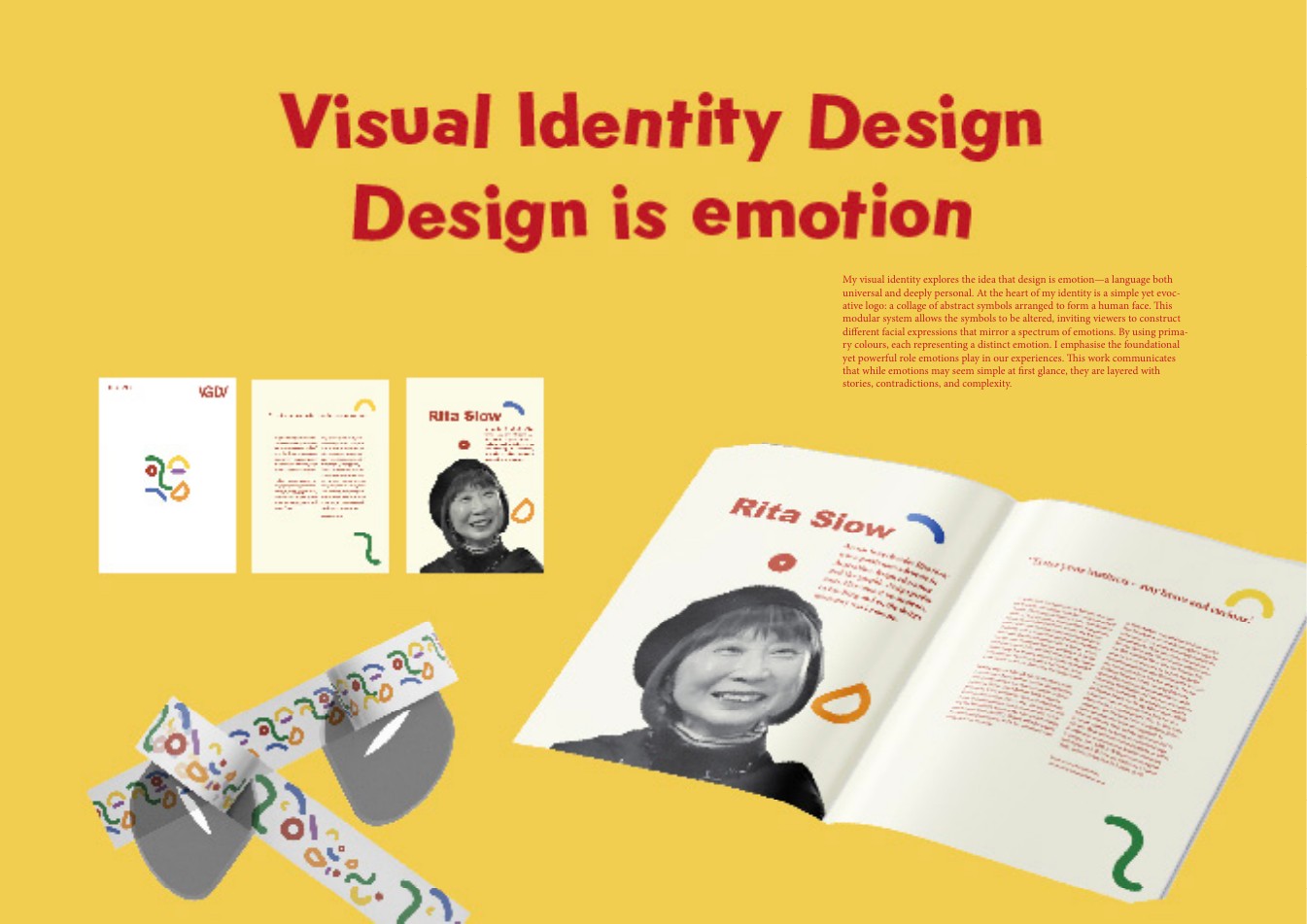
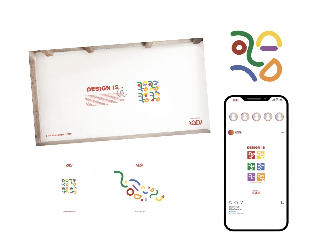
Design Is Emotion
A modular identity built from abstract symbols that assemble into a human face. Expressions and primary colours shift with the feeling, letting one visual language tell many layered, emotional stories.
01 · Structure
Reduced the idea of emotion into a small library of abstract visual parts.
02 · Exploration
Recombined the modules into faces with different expressions and colour relationships.
03 · Refinement
Built rules that let the identity shift across posters and social content while staying recognisable.
03 / 06
Brand identity
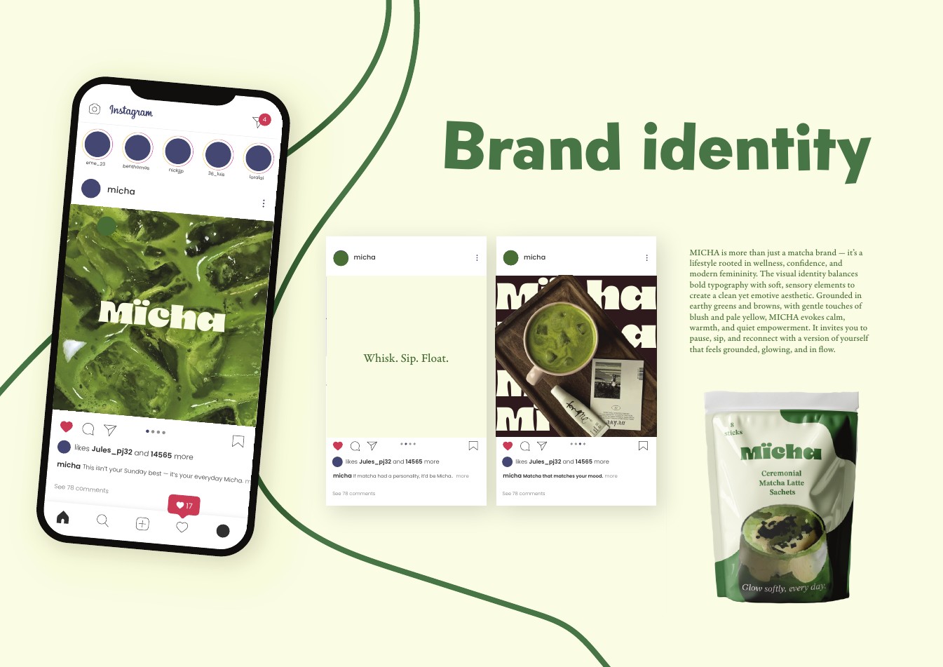
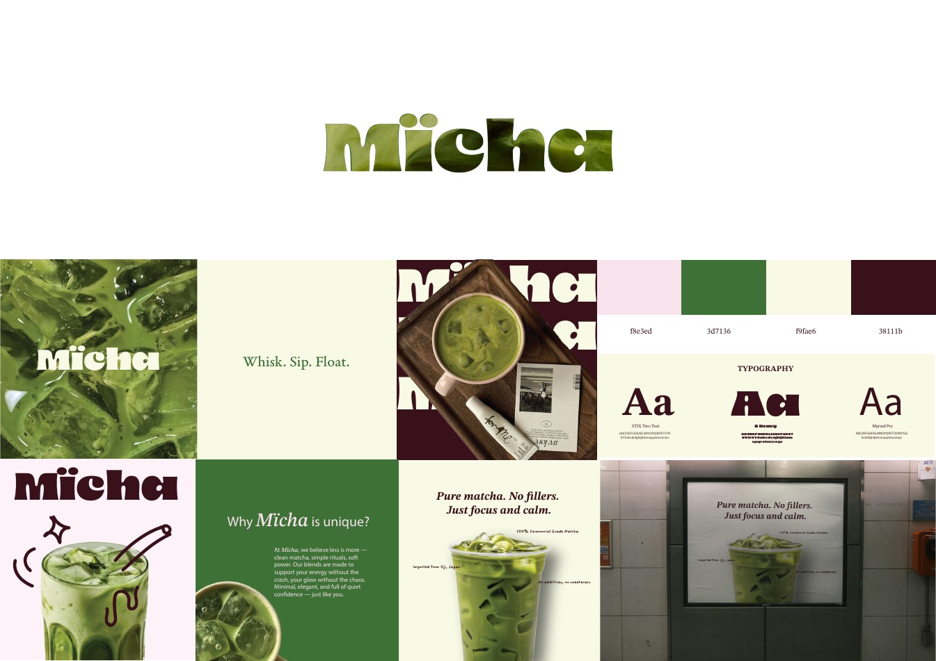
Mïcha
A contemporary matcha identity balancing confident typography with soft, sensory details. Earthy greens, blush and pale yellow create a calm system that moves easily from social storytelling to packaging.
01 · Structure
Defined the tension: confident modern femininity balanced with a calm daily ritual.
02 · Exploration
Paired bold typography with soft forms and tested earthy green, blush and pale-yellow combinations.
03 · Refinement
Codified the logo, palette and type system before extending it to social content and packaging.
04 / 06
Campaign + print
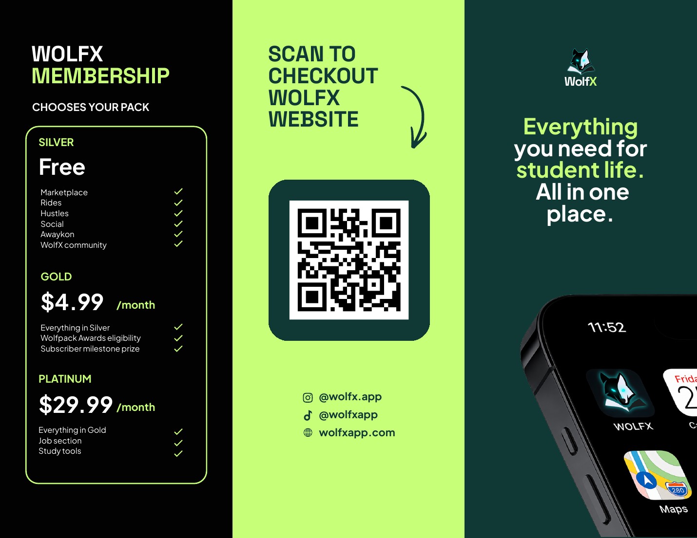
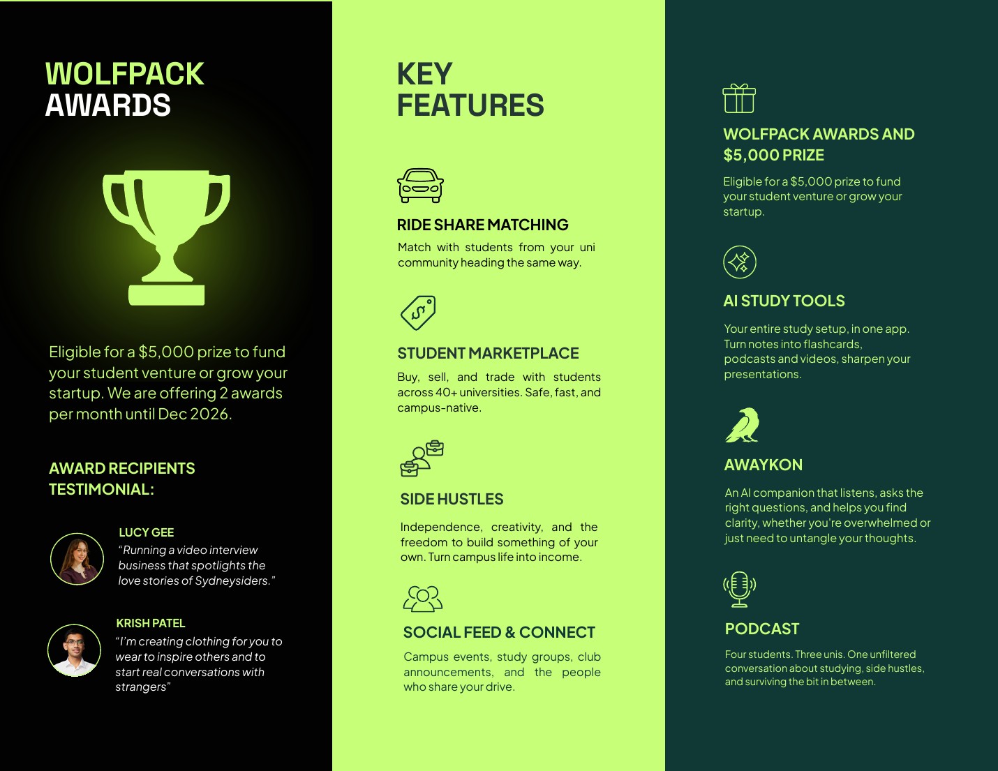
WolfX O-Week Brochure
A high-energy tri-fold that turns a feature-rich student platform into a clear, scannable story. Neon lime, dark teal and strong hierarchy lead new students from discovery to membership without losing the WolfX attitude.
01 · Structure
Audited dense membership and feature copy, then grouped it around the decisions students needed to make.
02 · Exploration
Tested panel order and scale so the folded brochure worked sequentially and at a glance.
03 · Refinement
Used neon lime, dark teal and a strong checkout call-to-action to clarify hierarchy without losing attitude.
05 / 06
Paid social campaign
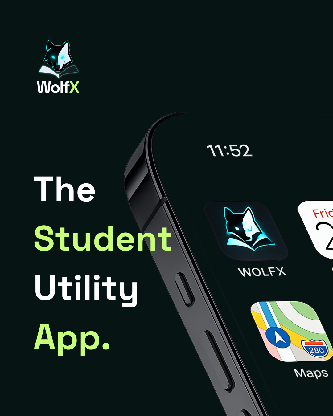
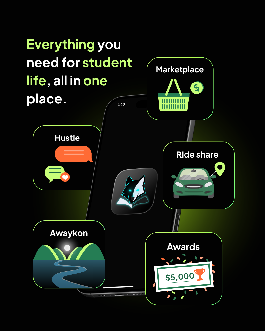
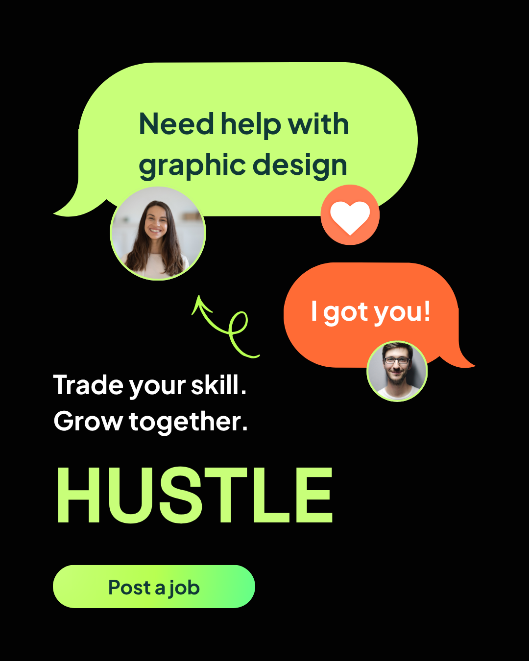
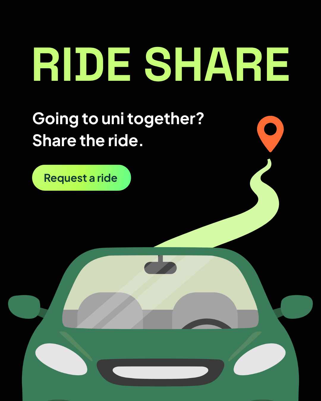
WolfX Meta Ads
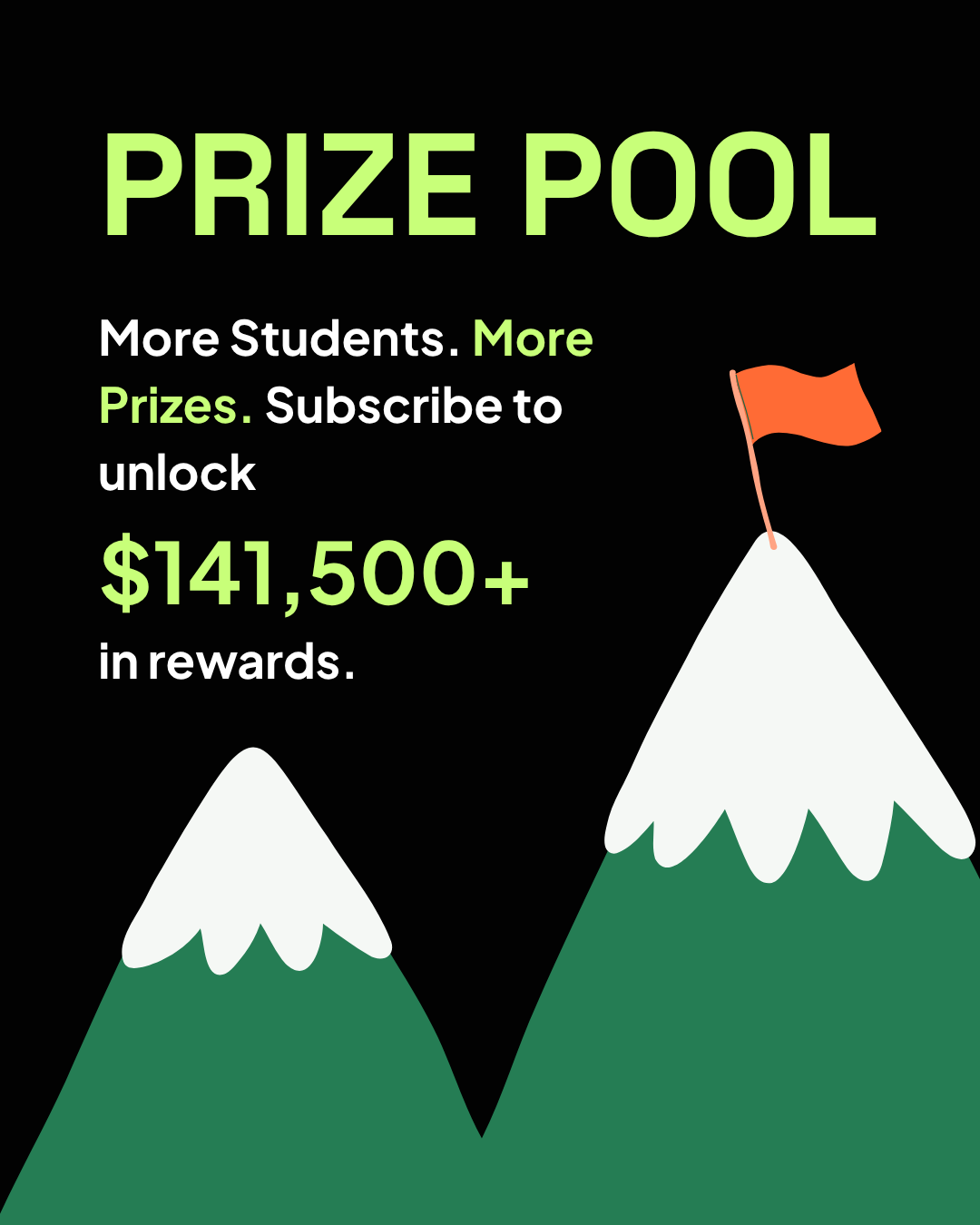
A modular paid-social campaign that introduces WolfX as an all-in-one student utility app, then turns individual features into focused, benefit-led stories for marketplace, side hustles, ride sharing, wellbeing and rewards.
01 · Structure
Separated a broad platform into one clear student benefit per advertisement.
02 · Exploration
Varied product mockups, feature icons and bold illustration while keeping the same campaign voice.
03 · Refinement
Standardised black, neon lime, oversized headlines and concise calls to action for fast feed recognition.
06 / 06
Education marketing
ECA College Campaign
A coordinated flyer and poster series promoting study pathways, career outcomes and a 20-year anniversary offer. The system uses ECA College’s blue-and-green palette, bold benefit-led headlines and clear information hierarchy across portrait formats.
01 · Structure
Organised course, pathway and location information around the questions prospective students need answered first.
02 · Exploration
Tested student imagery, diagonal brand geometry and headline scale across long-form flyer and poster formats.
03 · Refinement
Unified the series through ECA blue and green, repeated iconography and clearer benefit-led calls to action.
(What connects the work)
Identity is a system, not a decoration.
Across every project, I use layout to direct attention and give each brand a recognisable voice—one that stays coherent while adapting to different formats, messages and moments.